Categories
Types of charts and graphs turn raw data into clear, visual insights that are easy to understand and act on. Instead of scanning numbers, the right chart helps you instantly compare values, track trends, and uncover patterns.

Choosing the right chart isn’t just about design. Different types of graphs serve different purposes, from comparing categories to analyzing relationships or showing changes over time. Using the wrong chart can make even simple data confusing.
In this guide, you’ll explore the most important types of charts and graphs, when to use each one, and how to avoid common mistakes that reduce clarity and impact.
Modern visualization libraries offer dozens of chart formats, each engineered to address specific analytical challenges. Some formats shine when spotlighting differences between categories. Others track momentum across time periods or expose how variables interact.
You’ll encounter visuals built for distribution analysis, location-based patterns, and workflow documentation. Recognizing what each chart type delivers lets you bypass trial and error when building dashboards or crafting data presentations.
From standard bar graphs to specialized diagrams, understanding the complete toolkit ensures that types of data visualization charts translate into decision velocity.
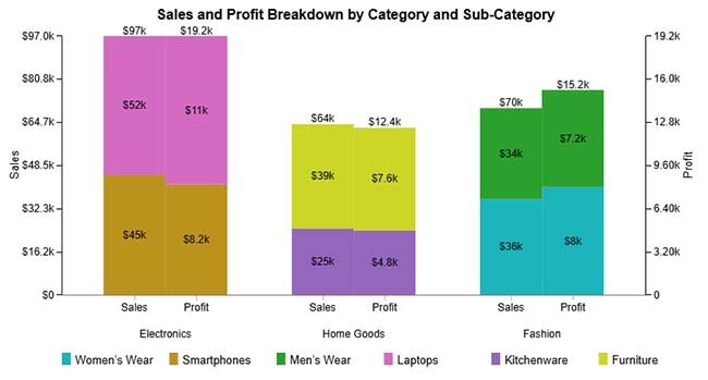
A Clustered Stacked Bar Chart layers category breakdowns inside grouped bars to reveal both aggregate totals and compositional details. Here, it demonstrates product categories split by sub-category contributions, showing Electronics, Home Goods, and Fashion sales alongside their profit drivers.
When to use Clustered Stacked Bar Charts?
Deploy this format when comparing totals across groups while exposing internal composition. Typical applications include revenue versus profit splits by department, regional performance segmented by customer type, or spending categories broken into line-item detail.
Best practices for Clustered Stacked Bar Charts
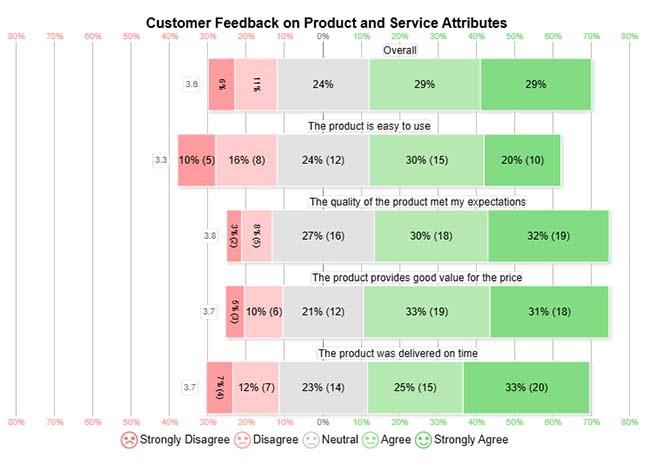
A Likert Scale Chart maps opinion distribution across structured response tiers to quantify sentiment intensity. This example captures customer reactions to usability, quality, value, and delivery speed, exposing where satisfaction concentrates.
When to use Likert Scale Charts?
Apply Likert formats when measuring opinions across multiple dimensions with consistent rating scales. Common scenarios include feedback surveys, workplace satisfaction assessments, product perception studies, and service evaluation forms.
Best Practices for Likert Scale Charts
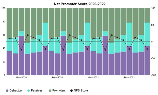
A CSAT Score Stacked Column Chart stacks satisfaction segments to visualize how response categories build the Net Promoter Score over time. Here, it tracks detractors, passives, and promoters month by month to reveal sentiment trajectory.
When to use CSAT Score Stacked Column Charts?
Choose stacked columns for satisfaction tracking when you need temporal context. They’re built for monitoring customer experience metrics across reporting periods and identifying when shifts occur.
Best Practices for CSAT Score Stacked Column Charts
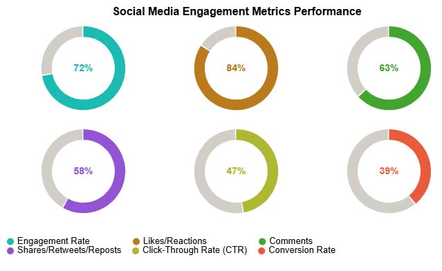
A Progress Circle Chart employs radial fills to communicate goal attainment at a glance. This visualization tracks social media KPIs engagement rate, likes, comments, and conversions with visual completion indicators.
When to use Progress Circle Charts?
Progress circles belong on dashboards where rapid status assessment matters. They’re designed for single-metric tracking against targets when you prioritize visual scanning speed over detailed analysis.
Best Practices for Progress Circle Charts
A Gauge Chart mimics dashboard instrumentation to plot performance against benchmarks. This example shows ROI percentages for marketing, product development, and customer retention investments using dial-based indicators.
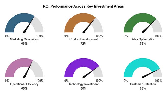
When to use Gauge Charts?
Gauges work when you’re comparing current values to predefined thresholds. They’re standard for KPI monitoring, investment return tracking, and real-time operational metrics where quick threshold assessment drives action.
Best Practices for Gauge Charts
A Comparison Bar Chart arranges categories horizontally to spotlight magnitude differences instantly. Here, office supply products are ranked by performance metrics, making relative strengths immediately visible across items like shredders, organizers, notebooks, and markers.
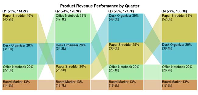
When to use Comparison Bar Charts?
Deploy bar comparisons when showing how multiple entities stack up against each other. They’re built for product rankings, sales leaderboards, and category performance assessments where hierarchy matters.
Best Practices for Comparison Bar Charts
A Pareto Bar Chart pairs descending bars with a cumulative percentage line to isolate high-impact contributors. This format reveals which few categories generate most of the total value, helping prioritize where effort yields maximum return.
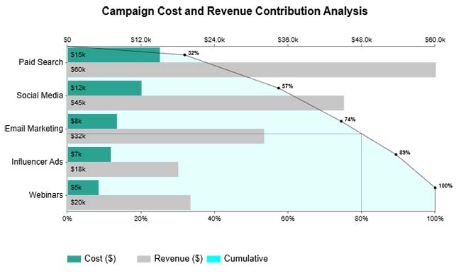
When to use Pareto Bar Charts?
Apply Pareto analysis when hunting for vital few versus trivial many patterns. Perfect for quality troubleshooting, resource allocation, and focusing improvement initiatives on leverage points.
Best Practices for Pareto Bar Charts
A Mosaic Plot partitions space proportionally to display multivariate categorical relationships. Here, goal completion, revenue contribution, and lead conversion are compared across categories through sized rectangles that reflect their relative weight.
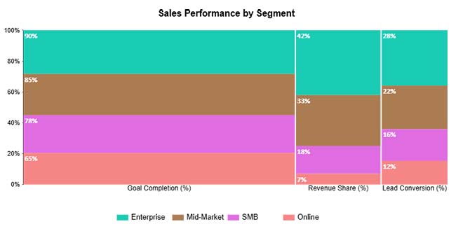
When to use a Mosaic Plot?
Mosaics excel at revealing how multiple categorical dimensions intersect and compare proportionally. They’re suited for complex datasets where you’re examining contribution patterns across several attributes simultaneously.
Best Practices for Mosaic Plot
A Slope Chart connects paired data points with angled lines to emphasize a change in direction. This example maps SEO traffic ranking shifts from the previous to the current period across locations, making gains and losses immediately apparent.
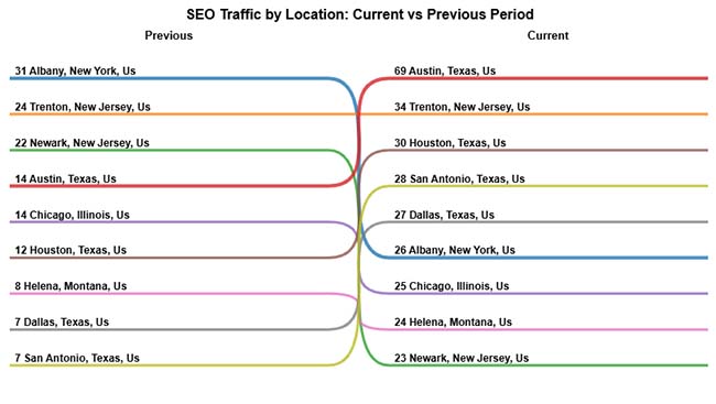
When to use Slope Charts?
Use slope formats when comparing two time snapshots and highlighting which items rose or fell. Perfect for before-and-after comparisons, ranking movements, and performance shift documentation.
Best Practices for Slope Charts
A Horizontal Waterfall Chart decomposes totals by showing incremental additions and subtractions horizontally. This visualization walks through quarterly budget changes, funding, costs, and adjustments to explain how starting amounts become final balances.
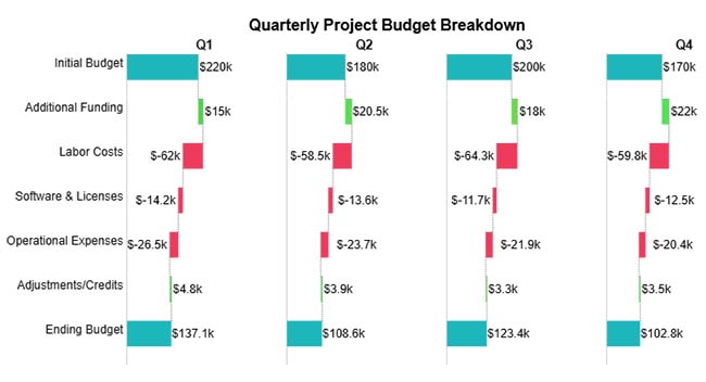
When to use Horizontal Waterfall Charts?
Deploy waterfalls when explaining sequential contributions to a cumulative outcome. They’re essential for variance analysis, budget walkthroughs, and profit bridge construction where step-by-step logic matters.
Best Practices for Horizontal Waterfall Charts
A Sankey Chart renders flows between stages using variable-width bands that communicate volume. Here, task movement from categories through roles and priority levels to final status is mapped, exposing workflow distribution and chokepoints visually.
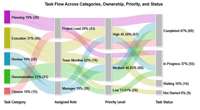
When to use Sankey Charts?
Sankeys shine when tracing quantities through multi-stage processes. They’re ideal for conversion funnels, resource allocation mapping, and identifying where volume accumulates or dissipates.
Best Practices for Sankey Charts
A Stacked Area Chart layers data series to show both individual trajectories and combined totals across time. This chart illustrates monthly traffic by source, revealing contribution patterns and aggregate growth dynamics channel by channel.
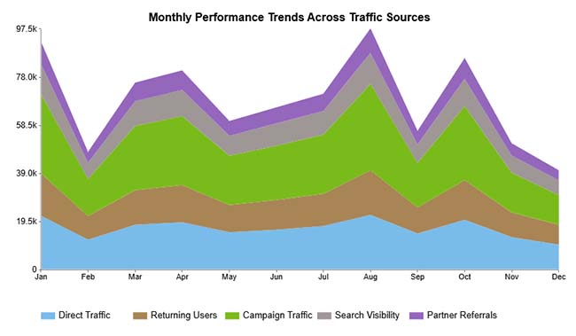
When to use Stacked Area Charts?
Choose stacked areas when demonstrating how parts accumulate into wholes over time. They’re designed to show compositional evolution and changes in relative contributions across reporting periods.
Best Practices for Stacked Area Charts
A Sunburst Chart displays hierarchical structures using nested rings where each ring represents a deeper level. Here, admissions workflow processes and statuses branch outward from the center, making organizational relationships explorable layer by layer.
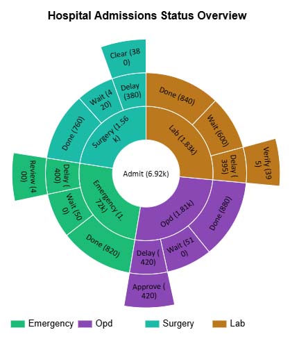
When to use Sunburst Charts?
Sunbursts work for navigating hierarchical data with multiple nested levels. They’re suited when you want interactive exploration of part-to-whole relationships within organizational or categorical structures.
Best Practices for Sunburst Charts
A Multi Axis Line Chart plots metrics with different scales on separate vertical axes within one frame. This multi-axis combo chart compares forecasted, planned, and consumed budgets (USD) month-by-month, highlighting how actual spending trends against projections throughout the year.
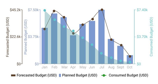
When to use Multi-axis Line Charts?
Apply dual-axis charts when comparing metrics that use incompatible units or scales during the same period. They reveal correlations and trend alignments that single-axis visuals can’t capture.
Best Practices for Multi-Axis Line Charts
A Sentiment Trend Chart combines bar volumes with trend lines to monitor attitude shifts over time. Here, completed versus delayed tasks are tracked monthly with an overlay that highlights overall performance sentiment evolution.
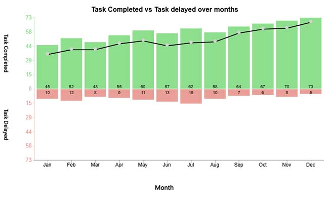
When to use Sentiment Trend Charts?
Deploy sentiment charts when tracking attitudinal or qualitative shifts across periods. They’re built for monitoring feedback trends, engagement patterns, and operational outcome improvements.
Best Practices for Sentiment Trend Charts
A Multi Series Line Chart overlays related metrics on shared axes to compare temporal patterns. This visualization tracks planned, expected, and actual story points across sprints, making divergence between estimates and reality visible.
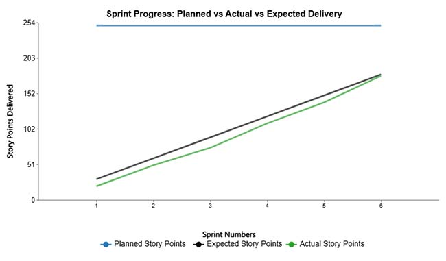
When to use Multi-Series Line Charts?
Use multi-series lines when comparing trend behaviors of related metrics across identical timeframes. They’re perfect for spotting synchronization, gaps, or alignment between planning and execution.
Best Practices for Multi-Series Line Charts
A Histogram bins continuous data into intervals and plots frequencies to reveal the distribution shape. This example shows sales amount spread across value ranges, exposing concentration zones and frequency patterns within the dataset.
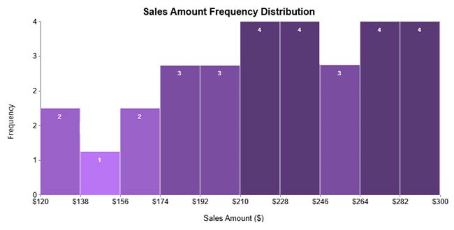
When to use Histograms?
Histograms belong wherever you’re analyzing continuous variable distribution, spread, and frequency. They’re essential for understanding data characteristics, identifying clustering, and spotting unusual observations.
Best Practices for Histograms
A Box and Whisker Plot employs columnar box plots to compare data distributions across categories. Here, quarterly financial metrics, marketing spend, operational cost, and product revenue are displayed, showing spread, central tendency, and box plot outliers.
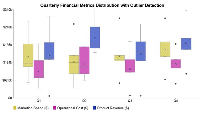
When to use a Box and Whisker Plot?
Box plots excel at comparing distributions, identifying variation ranges, and flagging anomalous data points across multiple categories or groups.
Best Practices for Box and Whisker Plot
A Grouped Dot Plot arranges individual observations by category to reveal distribution differences. This chart presents cholesterol levels for different treatment modalities, showing variation and clustering patterns within each therapeutic group.
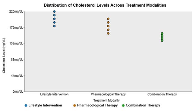
When to use a Grouped Dot Plot?
Dot plots work when comparing individual-level distributions across categories, particularly with datasets small enough that plotting every point remains practical.
Best practices for Grouped Dot Plot
A Word Map Chart colors geographic regions by value intensity to display location-based patterns. Here, global internet usage by country is mapped, revealing where online populations concentrate most heavily worldwide.
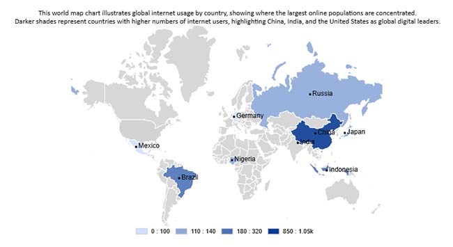
When to use Word Map Charts?
Geographic maps belong in analyses focused on regional patterns, spatial concentrations, or location-driven variations in your metrics.
Best practices for Word Map Charts
A Heatmap Chart applies color saturation to encode values, making patterns visible instantly. This example highlights healthcare factor impacts across SWOT categories, helping identify critical strengths, weaknesses, opportunities, and threats through color density.
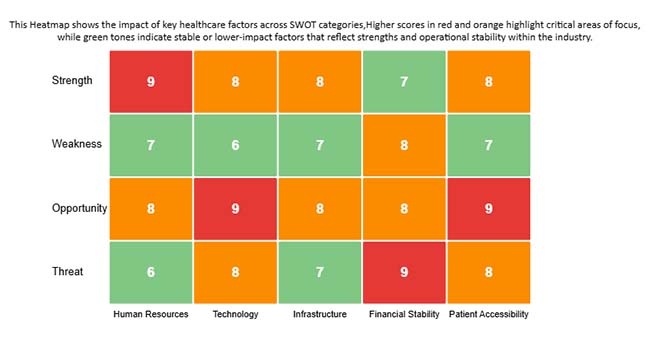
When to use Heatmap Charts?
Heatmaps work when rapid pattern identification matters more than precise value reading. They’re built for correlation matrices, time-intensity analysis, and large-scale data comparison through color variation.
Best Practices for Heatmap Charts
Creating different types of charts and graphs effectively requires a structured approach to ensure your data tells a clear story. Follow these steps to turn raw numbers into meaningful visualizations:
Decide what you want your chart to communicate, whether it is comparing values, showing trends over time, highlighting distributions, or uncovering correlations. A clear goal guides the chart type selection.
Identify the type of data you have, such as categorical, numerical, or time series. This ensures the chart you choose accurately represents the information.
Select a chart that aligns with your objective and data type. For comparisons, use bar or column charts. For trends over time, use line charts. For proportions, use pie or donut charts. For relationships or correlations, use scatter plots.
Organize your dataset, remove inconsistencies, and standardize formatting. Clean data ensures your visualization is accurate and easy to interpret.
Keep visuals simple with consistent colors, clear labels, and no unnecessary elements. Ensure your audience can understand insights at a glance.
Leverage tools such as Excel, Google Sheets, or ChartExpo to create your charts. ChartExpo simplifies building advanced visualizations without coding, making it easy to produce professional charts quickly.
Check the chart for accuracy, readability, and clarity. Make sure it communicates your intended message effectively and highlights key insights.
Example:
Selecting appropriate types of charts and graphs ensures communication clarity and drives action.
Thoughtfully chosen graph types transform data into compelling narratives, boost understanding, and enable decisive action.
What are the five basic types of charts?
Bar Charts, Line Charts, Pie Charts, Scatter Plots, and Area Charts represent the foundational visualization formats. These chart types underpin most analytical displays across reporting environments and dashboard applications.
What are the most commonly used charts?
Bar Charts, Line Charts, Pie Charts, Heatmaps, Histograms, Box and Whisker Charts, and Scatter Plots are frequently deployed because they communicate comparisons, trajectories, proportions, and relationships effectively across diverse graph types.
How do I choose between different types of charts and graphs?
Base chart selection on data structure, analytical intent, and viewer context. Understanding when different graph types apply guarantees clarity, precision, and persuasive storytelling in data visualization.
Choosing the right type of chart or graph begins with understanding your analytical goal. Use bar and column charts to compare categories, line charts to highlight trends over time, and histograms or box plots to explore distributions.
Stacked bars or area charts are ideal for showing parts of a whole, while Pareto charts help identify the “vital few” contributors driving results. Scatter plots and Sankey diagrams are effective for revealing relationships and flows, and maps or heatmaps provide geographic or intensity-based insights.
Always keep labels clear, use colors thoughtfully, and ensure the visualization aligns with your audience’s needs. With clean and well-structured data, tools like Excel, Google Sheets, or add-ons make it easy to create professional, actionable data visualizations quickly.
How much did you enjoy this article?


Calculate accounts receivable turnover ratio to measure credit collection speed, improve cash flow, and strengthen your financial strategy. Read on!

Change Management KPIs are the key to tracking adoption, performance, and ROI during transitions. Find out which metrics matter. Read on!

Data collection methods and techniques determine the quality of every insight you act on. Explore key approaches for gathering reliable data. Read on!


