20% Effort = 80% Result.
Learn how you can simplify.
For every complex problem you face, there is a simple solution.
You don’t solve complexity with more complexity.
Pareto Chart is an insightful visualization that helps decision-makers solve complex problems easily.
Google Sheets
Microsoft Excel
Free 7-day trial (no purchase necessary). Pricing starts at $10 per month.
 ChartExpo for Google Sheets is
 used by 700,000+ users worldwide!


How to Install YouTube Videos
How to create a Pareto Chart
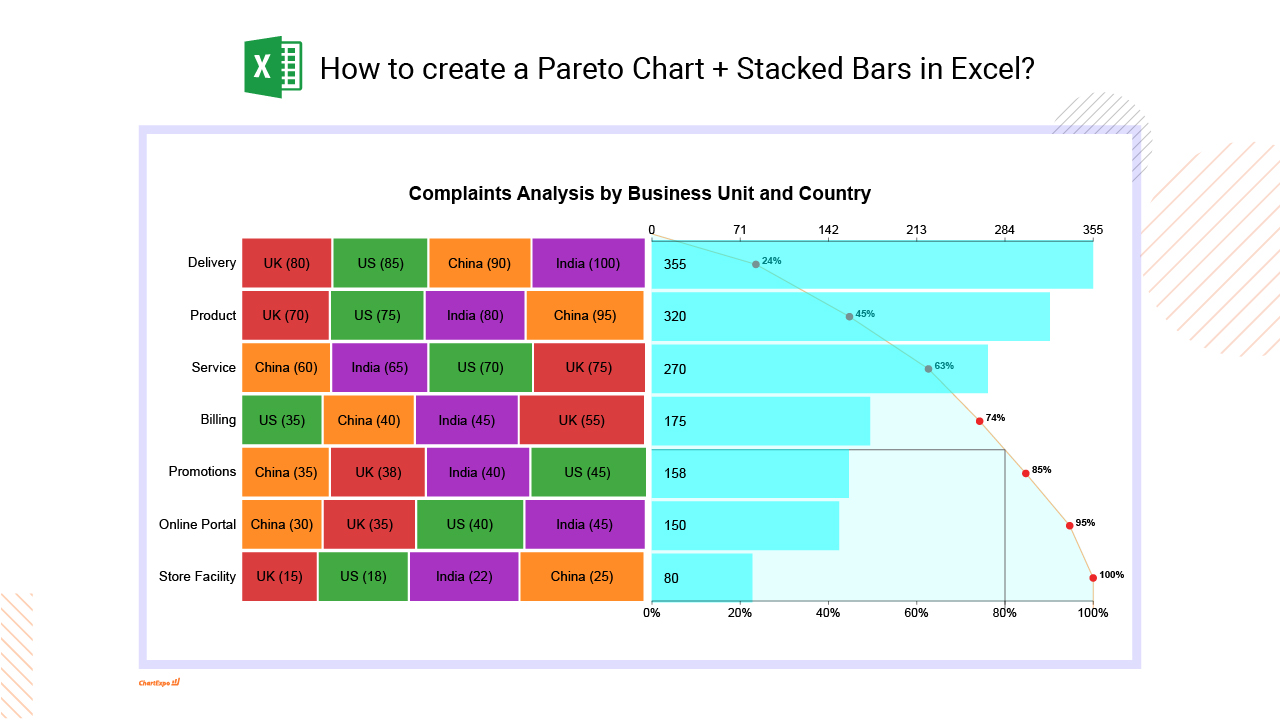
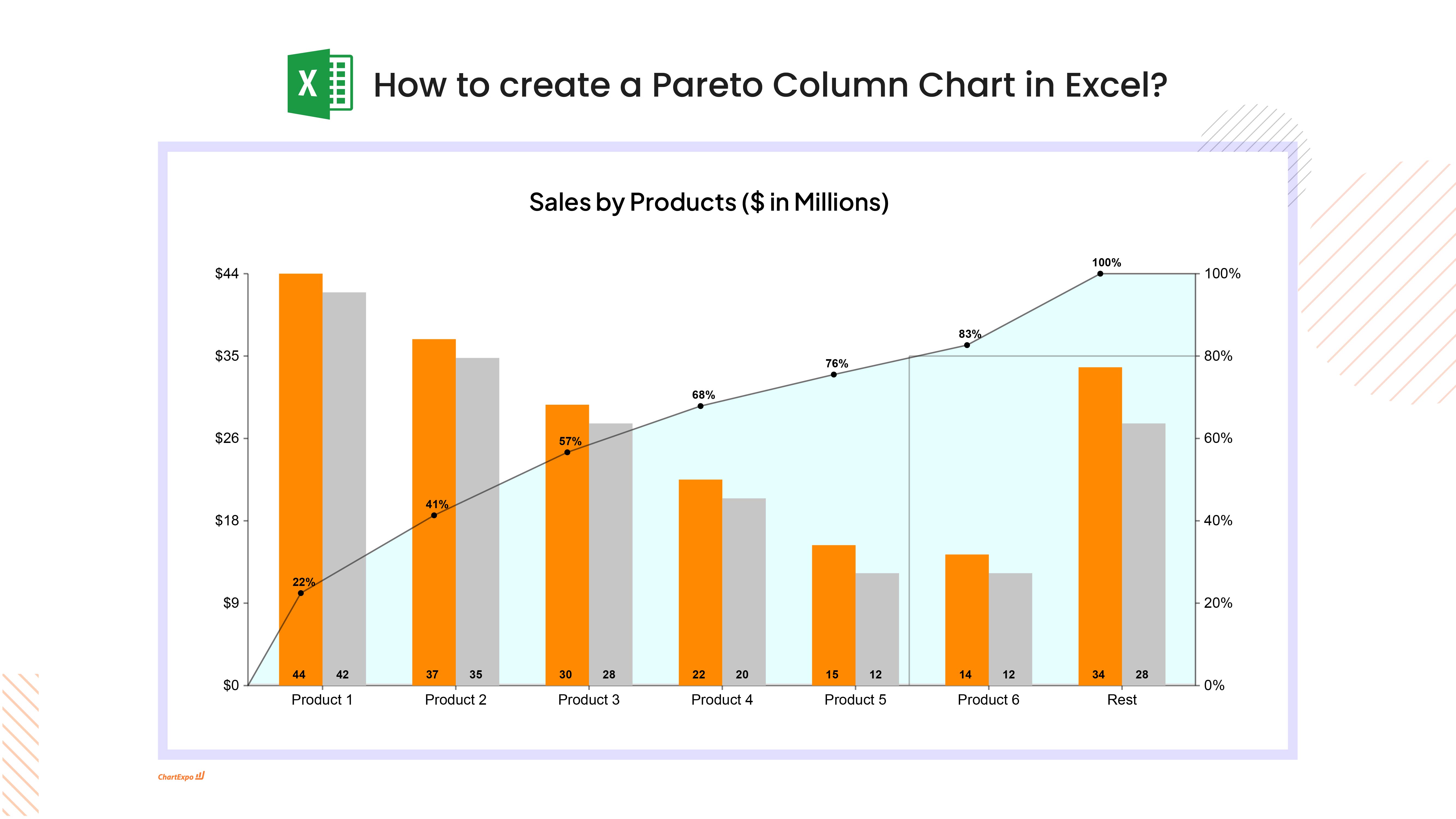
Pareto Chart Excel: How-to
Here's how-to create a Pareto Chart in Excel:
-
Install Add-in: Install the ChartExpo add-in for Excel from the Microsoft AppSource store; it provides a simple, no-code Pareto Chart Maker.
-
Prepare Data: Include one categorical column (for example, Causes or Items) and one numeric column (for example, Frequency or Impact); sort the data in descending order to highlight the vital few versus the trivial many like a Pareto table.
-
Open ChartExpo: In Excel, click the Add-ins icon, then select ChartExpo to begin building your visualization that illustrates the Pareto Principle.
-
Choose Chart Type: From the available charts in ChartExpo, choose the Pareto Chart option to show bars for frequency or impact and a cumulative percentage line for your Pareto Chart Excel workflow.
-
Select the Data: Highlight the data cells in Excel, including headers, so ChartExpo correctly maps categories and values into the layout typical of a Pareto Graph Excel.
-
Create the Pareto Chart: Click “Create Chart From Selection” to generate the chart. The chart displays bars sorted by impact and a cumulative line that clearly shows the 80/20 Rule.
-
Customize Look: Adjust colors, cumulative line styling, labels, and other settings; add titles or annotations as needed to match your presentation or report when refining a Pareto Diagram Excel.
-
Export: Export the finished chart as PNG, PDF, or SVG for reports, presentations, or dashboards, and reuse it for ongoing Pareto analysis.
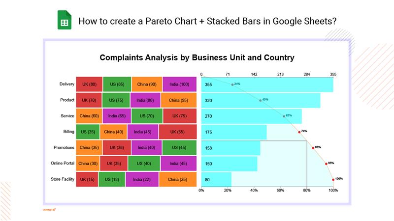
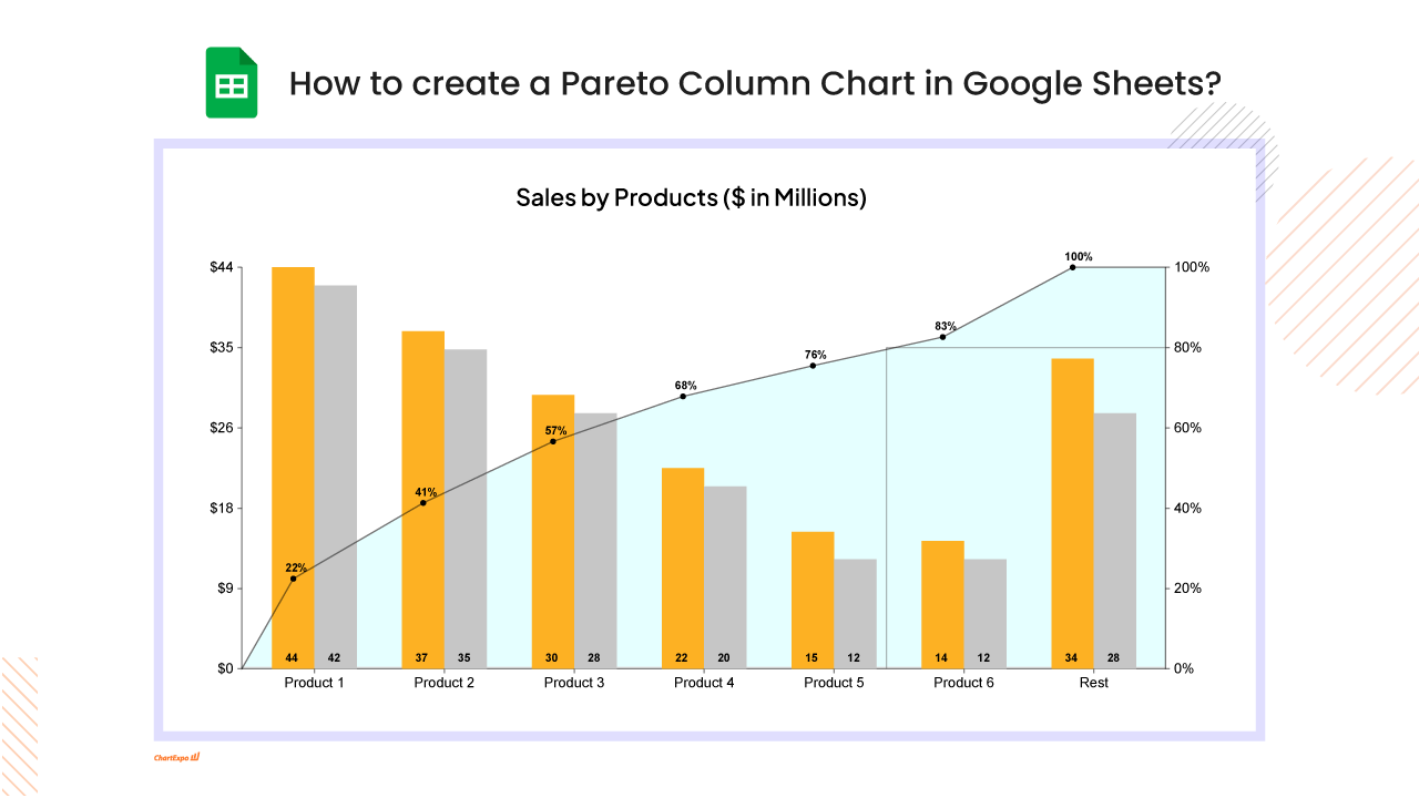
Pareto Chart Google Sheets: How-to
Here's how-to create a Pareto Chart in Google Sheets:
-
Install the Add-on: Install the ChartExpo add-on for Google Sheets from the Google Workspace Marketspace store. This is the first step in How to create a pareto chart in Google Sheets.
-
Prepare your Data: Build a Pareto table with one categorical column (causes, items, or labels) and one numeric column (frequency, cost, or impact), sorted in descending order to highlight the 80/20 Rule.
-
Open Extensions: In Google Sheets, go to Extensions and launch ChartExpo, a Pareto Chart Maker that streamlines Pareto analysis.
-
Select Pareto Chart: From the chart gallery, select the Pareto Chart, also known as a Pareto Graph.
-
Map your Data Fields: In the ChartExpo sidebar, map your category and value columns so the Pareto Plot reads the correct data.
-
Create Chart: Click Create Chart button to generate the chart; bars plus a cumulative line emphasize the vital few versus the trivial many in line with the Pareto Principle, producing a clear Pareto Diagram.
-
Customize: Use ChartExpo options to adjust colors, titles, labels, and cumulative line styling for maximum clarity and presentation impact on your Pareto Chart.
-
Export: Export as PNG, PDF, or SVG for easy sharing in presentations, reports, or dashboards.
What Is a Pareto Chart?
A Pareto Chart ranks categories from highest to lowest impact and overlays a cumulative percent line. That combination makes the “vital few” stand out without guesswork. Some teams call it a Pareto Plot or Pareto Graph, and it supports Pareto Analysis by turning scattered counts or costs into a clear priority list. It fits categorical data, where each label represents a bucket. The sorted bars answer what hurts most. The line answers how much of the total is covered so far. It isn’t a magic rule, just a disciplined ranking method. And clean category definitions matter as much as the math.
Key Components of Pareto Chart
The structure is simple, but every part has a job. In older templates, this can show up under the label Graph Pareto.
- Bars show frequency, cost, or another impact metric by category. They must be sorted from largest to smallest.
- A line tracks the cumulative percentage across the sorted categories. It makes the cutoff point obvious.
- The X-axis lists categories as discrete labels, not continuous bins. Clear naming prevents duplicate buckets.
- The left Y-axis scales the bar values so differences are visible. Keep units consistent across the view.
- The right Y-axis scales the cumulative line from 0% to 100%. If it isn’t labeled, readers will misread it.
When to Use Pareto Chart
Use this visualization when there are many categories and limited time. It works best when a clear ranking drives next steps.
- Quality Control: rank defect types by count, scrap cost, or rework hours. Then target the top drivers in the next sprint.
- Customer Service: find the complaint reasons driving repeat contacts. Pair it with call notes to confirm wording and intent.
- Process Improvement: identify which steps generate most delays or errors. Fix upstream issues before tuning downstream steps.
- Sales & Marketing: see which channels produce most qualified leads or most churn. The line shows whether focus should narrow.
- Risk Management: prioritize risk sources by expected loss or incident rate. Use consistent time windows to avoid seasonality traps.
Why Use Pareto Chart
Prioritization is the whole point. The view makes tradeoffs explicit instead of political.
- Highlights the few categories driving most impact, not the long tail. That prevents “everything is critical” paralysis.
- Creates a defensible backlog for fixes, audits, and experiments. Stakeholders can see why an item moved up or down.
- Speeds meetings because the ranking answers “what first?” The cumulative line backs up the decision.
- Quantifies payoff by tying actions to movement in cumulative percent. Improvements become measurable, not anecdotal.
- Works with counts, dollars, minutes, or any consistent metric. Mixed units belong in separate visuals.
- Pairs well with root-cause work once the top categories are known. A smaller target list makes deeper analysis feasible.
Types of Pareto Chart
Not every situation needs the same layout. Some teams still call it a Pareto Diagram. That wording shows up in older QA docs.
- Standard Pareto Chart: one metric, one category list, one cumulative line. It’s the default for counts and costs.
- Weighted Pareto Chart: bars reflect severity, cost, or effort-weighted impact, sometimes presented as a Pareto Bar Chart. Document the weighting rules.
- Comparative (or Grouped) Pareto Chart: compare rankings across teams or time periods. Keep color and scale consistent.
- Multi-Dimensional Pareto Chart: break a top category into subcategories for a second pass. It helps avoid vague buckets like “Other.”
- Horizontal Pareto Chart: useful when category labels are long or numerous. It improves readability without changing the math.
How to Read & Interpret Pareto Chart?
Read the bars first, then the line. A quick Pareto Chart analysis should end with a ranked action list for the next cycle.
- Identify the "Vital Few": find the smallest set of categories producing most impact. This is often where the line crosses 70% to 90%. Use that cutoff to define what gets attention now. Keep the cutoff documented.
- Focus on the Left: the first bars usually drive the biggest cumulative jump. If the left side is flat, the problem is spread out. Past the bend, returns usually drop. And verify totals before acting.
- Assess Impact: check whether the jump is steep or gradual across categories. A smooth climb means fixes must be broad. A sharp climb suggests a narrow, high-payoff target.
- Prioritize Actions: target items that move the line meaningfully with realistic effort. Big bars with low effort tend to win. Assign owners and dates so the ranking turns into work.
- Validate Context: the Pareto Plot only works when categories and metrics are consistent. Bad grouping can manufacture a fake top driver. If categories overlap, rebuild the grouping before acting.
Pareto Chart Analysis & Insights
Identify High-Impact Areas
- Use a quick Pareto Chart analysis to separate loud problems from costly ones. Look for top categories that explain 60% or more of impact.
- Check whether “Other” is large, which signals weak categorization. If “Other” is big, the next action is recoding, not fixing.
Prioritize Solutions
- Pick interventions that reduce the biggest bars, not the most visible complaints. Tie each bar to a concrete process or system owner
Simplify Complexity
- Summarize dozens of categories into a short list that leadership can act on. Keep the long tail available as detail, not as the main story. This improves executive scanability.
Strategic Focus
- Track the cumulative line over time to see if fixes shift the distribution. If the top bars stay flat, the intervention missed the real driver.
Pareto Chart Use Cases
This view shines when resources are constrained. It keeps teams from treating every issue as equal.
- Prioritizing Issues: rank defects, tickets, or outages by business impact. Use a stable time window, like 30 or 90 days, so comparisons hold.
- Root Cause Analysis: choose which causes deserve deeper investigation first. Then apply drilldowns only to the top categories to avoid rabbit holes.
- Resource Allocation: align staffing and budget with the highest-impact categories. The cumulative line helps set cutoffs, like “top 3 categories this quarter.”
- Monitoring Improvement: compare before-and-after distributions to confirm change. A shrinking top bar is a strong signal, even if totals vary.
Advantages of Pareto Chart
The biggest advantage is clarity. A Pareto Graph forces a ranked conversation, which is rare and valuable.
- Focus & Prioritization: turns a messy list into a short action queue. Teams stop spreading effort thin.
- Data-Driven Decisions: replaces gut feel with counts and cumulative percent. That reduces debate-by-volume.
- Resource Optimization: aims effort at the biggest payoff categories. It supports planning conversations with numbers.
- Improved Communication: a Graph Pareto view explains tradeoffs to non-analysts. The line makes “coverage” easy to see.
- Enhanced Problem Solving: pairs naturally with cause-and-effect methods. Once priorities are set, investigation gets sharper.
- Root Cause Identification: helps decide where to dig for underlying drivers. Time is spent where the payoff is highest.
Pareto Charts vs. Bar Charts and Histograms
| Feature | Pareto Chart | Bar Chart | Histogram |
|---|---|---|---|
| Order of bars | Strictly sorted high to low | Any order or grouped | Bins in numeric order |
| Presence of cumulative percentage line | Yes, cumulative % line | No cumulative line | No cumulative line |
| Primary purpose | Prioritize categories by total impact | Compare category values | Show distribution of continuous data |
| Relationship to the 80/20 rule | Often used to test 80/20 patterns | Not tied to 80/20 | Not tied to 80/20 |
| Type of data used (categorical vs. continuous) | Categorical categories | Categorical categories | Continuous numeric values |
| Typical use cases | Defects, complaints, losses, delays | Category comparisons | Variability, spread, skew |
Practical Tips for Building an Effective Pareto Chart
A Pareto chart works best when the data is consistent, well-organized, and focused on action. These tips help ensure your chart highlights the real drivers behind a problem, not just the noise.
- Define one clear metric: Use a single measure like frequency, cost, or time so all categories are compared fairly.
- Sort causes by impact: Arrange categories from highest to lowest and group minor items into an “Other” category.
- Use a cumulative percentage line: Pair bars with a cumulative line on a secondary axis to reveal the 80/20 effect.
- Ensure data accuracy: Validate totals and percentages so the final bar aligns with 100 percent.
- Focus on action: Use the chart to identify priority areas, not just to display data.
Common Mistakes to Avoid in Pareto Chart
Most failures come from bad inputs, not bad visuals. Fix the setup and the ranking becomes trustworthy.
- Poor Categories: inconsistent labels split the same problem into multiple bars. Standardize naming rules early.
- Insufficient Data: tiny samples turn random noise into fake “top issues.” Use a longer window or combine periods.
- Misleading Weighting: weights must reflect real cost or severity, not vibes. Document the formula and stick to it.
- Changing Definitions: shifting category rules breaks comparisons over time. Version the mapping when it changes.
- Ignoring the Metric: counts and dollars tell different stories. Choose one per view, then compare separately.
Pareto Chart Dataset Example
| Issue Category | Ticket Count |
|---|---|
| Login failures | 42 |
| Billing questions | 30 |
| Password resets | 18 |
| App crashes | 12 |
| Shipping delays | 8 |
| Other | 5 |
This Pareto Diagram example uses ticket counts by issue category. Sort the categories by count, then compute cumulative percent. Most teams will see the first two or three categories dominate the total, which is the signal used to prioritize fixes.
Tools to Create Pareto Chart
Tool choice matters less than data hygiene. Still, a solid workflow saves time and prevents spreadsheet folklore.
ChartExpo For Excel
ChartExpo can act as a Pareto Chart generator when Excel’s built-in options feel rigid. It helps with sorting, the cumulative line, and clean labels without manual helper columns. For teams standardizing outputs, it also works like a Pareto Diagram maker and supports a shared Pareto Chart template. It’s useful for ad hoc work where the dataset changes weekly.
ChartExpo For Google Sheets
In Sheets, ChartExpo supports repeatable setups and avoids copy-paste drift. That matters when teams share a Pareto Chart template across projects and need consistent outputs. It can also serve as a lightweight Pareto Chart creator when the audience lives in a browser tab. Shared editing and permissions make it handy for distributed teams.
Power BI
Power BI works well for governed reporting and refreshable models. A DAX measure for cumulative percent plus a combo visual can replace a one-off Pareto Chart maker. It also becomes a Pareto Chart generator when filters, drilldowns, and row-level security are required. It also supports governed refresh and consistent definitions across reports.
Legacy naming like Graph Pareto or Pareto Bar Chart is fine if definitions and metrics stay stable.
FAQs
What is the 80 20 rule Pareto Chart?
It describes a common pattern where a small number of categories drive most impact. A Pareto Chart 80 20 check uses the cumulative line to see how quickly totals reach about 80%. The real value is prioritization, even when the split isn’t perfectly 80/20.
What kind of data is best for Pareto Charts?
Categorical data with a consistent metric works best, such as defect types with counts or complaint reasons with cost. Avoid mixing units in one view. If severity matters, use weights and document the rules.
What is a real life example of Pareto Analysis?
A support team can group tickets by reason and discover that two reasons create 65% of volume. Fixing those workflows reduces backlog faster than spreading effort across minor issues. The same approach fits scrap, billing disputes, and outage causes.
What industries commonly use Pareto Charts?
Manufacturing, healthcare, customer support, logistics, finance, and SaaS operations use them often. Any place with recurring categories and limited improvement bandwidth is a fit. It is also common in audit work because it documents prioritization.
ChartExpo Pricing
ChartExpo for
Google Sheets
$10*
per month
(no purchase necessary)
*pricing starts at $10
per user per month.
Only in-app purchase available
ChartExpo for Google Sheets
single-user purchase video.
ChartExpo for Google Sheets
domain-users purchase video.
ChartExpo for Google Sheets
single-user installation video.
ChartExpo for Google Sheets
admin installation video.
ChartExpo for
Microsoft Excel
$10*
per month
(no purchase necessary)
*pricing starts at $10
per user per month.
Only in-app purchase available
ChartExpo for Excel single-user
purchase video.
ChartExpo for Excel domain-users purchase video.
ChartExpo for Excel single-user
installation video.
ChartExpo for Excel admin
installation video.
Custom Pricing
Videos
4:18
6:07
7:37
5:33
Blogs
Tail Spend Analysis: A Complete Walkthrough
Tail spend analysis helps reduce overlooked procurement costs. Discover how managing tail spending can improve efficiency and save money in business.

Management Reporting: What Executives Actually Want to See
Get better insights with management reporting. Track growth, efficiency, and financial performance. Learn how reports drive business decisions and strategy.
80-20 Rule: The Math Is Simple. The Impact Isn’t.
80-20 rule missteps can cost growth and alignment. Are you focusing on the right 20% or missing what matters?
Best Types of Charts and Graphs for Data Visualization
Discover the best types of charts and graphs for visualizing data. You will also learn how to create different types of graphs, charts.
Sales Tracking Spreadsheet for Better Insights
A Spreadsheet for Sales Tracking organizes data, tracks performance, and analyzes trends.