Simplify Data, Reveal
Correlations.
Data can often seem chaotic and challenging, but it doesn’t have
to be. ChartExpo’s Scatter Plot Chart makes it simple to map data
points, uncovering correlations, trends, and hidden insights you
may have otherwise missed.
Google Sheets
Microsoft Excel
Free 7-day trial (no purchase necessary). Pricing starts at $10 per month.
 ChartExpo for Google Sheets is
 used by 700,000+ users worldwide!


How to Install YouTube Videos
How to create a Scatter Plot Chart
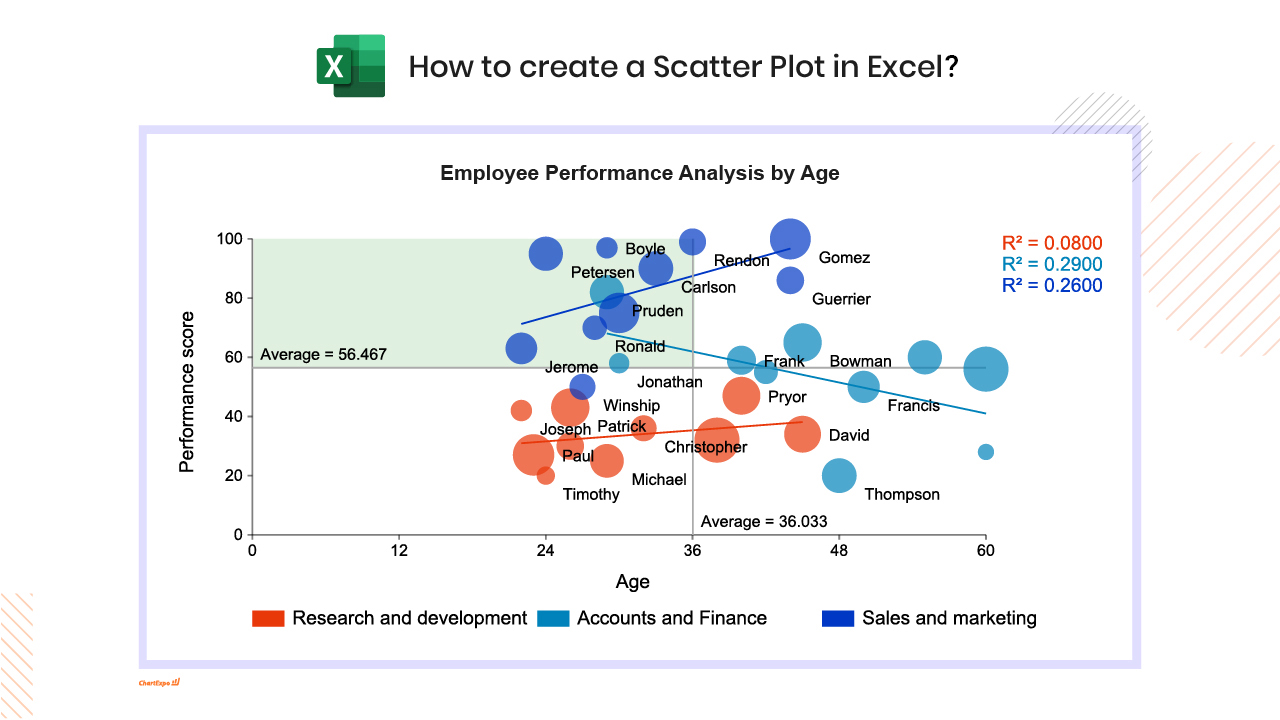
Scatter Plot Chart Excel: How-to
Here's how-to create a Scatter Plot Chart in Excel:
-
Install the Add-in: Install the ChartExpo add-in for Excel from the Microsoft AppSource store; It supports creating Scatter plot charts in a simple, no-code way.
-
Prepare your Data: For a scatter plot chart Google Sheets setup, your data should include two to three numeric columns (metrics for X, Y, and optionally size). You can also add up to two categorical columns to distinguish groups or categories within your chart.
-
Load ChartExpo: In Excel, click the Add-ins icon, then select ChartExpo to start building your Scatter plot chart visualization.
-
Select Scatter Plot Chart: From the available charts in ChartExpo, choose the Scatter Plot Chart option to display relationships and correlations between variables.
-
Select the Data: Highlight the data cells in Excel, including headers, so ChartExpo maps categories and values correctly into the Scatter plot chart format.
-
Create the Scatter Plot Chart: Click Create Chart From Selection to generate the scatter plot. The chart will display data points on a coordinate plane, showing relationships, correlations, and patterns between variables.
-
Customize: Adjust colors, cumulative line styling, labels, and other settings to match your presentation or report needs. Add titles or annotations if required.
-
Export: Export the Scatter plot chart in formats like PNG, PDF, or SVG for reports, presentations, or dashboards.
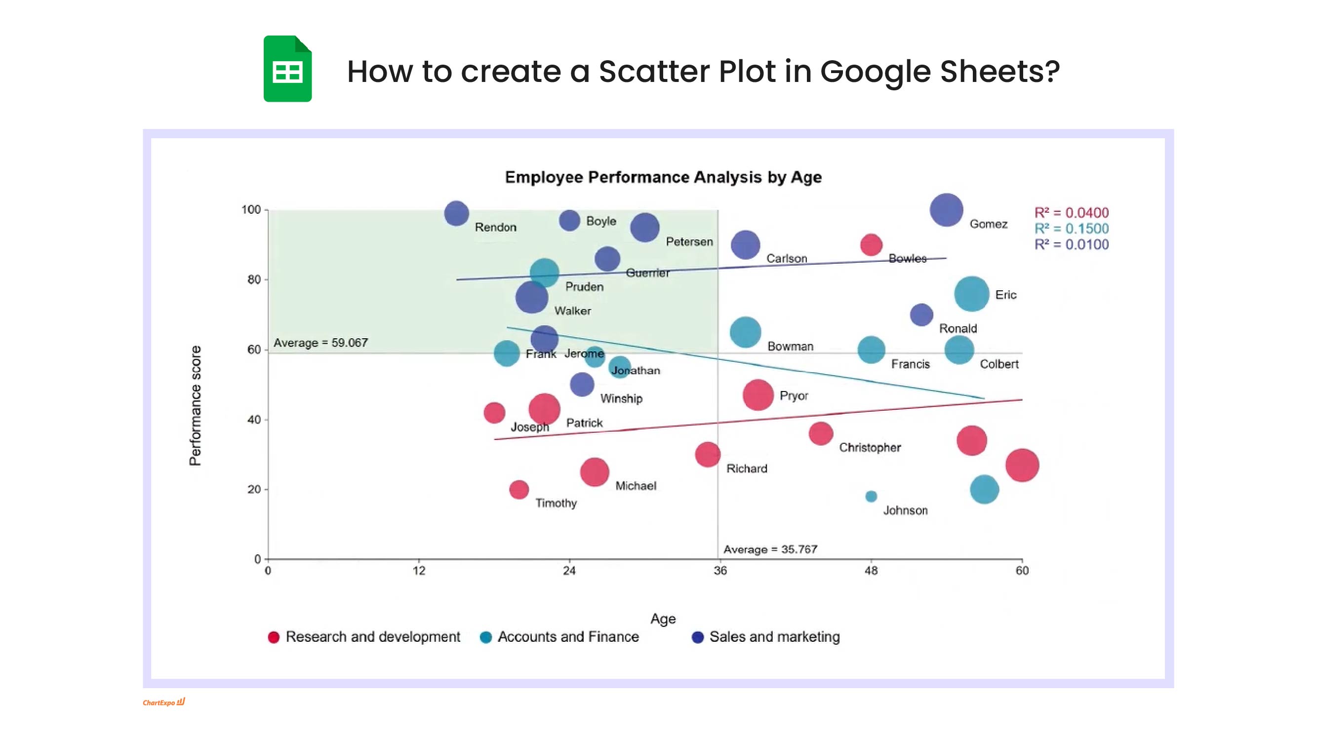
Scatter Plot Chart Google Sheets: How-to
Here's how-to create a Scatter Plot Chart in Google Sheets:
-
Install the Add-on: Install the ChartExpo add-on for Google Sheets from the Google Workspace Marketspace store. This is the first step in How to create a scatter plot chart in Google Sheets
-
Prepare your Data: For a scatter plot chart Google Sheets setup, your data should include two to three numeric columns (metrics for X, Y, and optionally size). You can also add up to two categorical columns to distinguish groups or categories within your chart.
-
Access Extensions: Select and launch ChartExpo from the “Extensions” menu.
-
Select Scatter Plot Chart: Select the Scatter Plot Chart from the list of available charts.
-
Map your Data Fields: In the sidebar dialog, select the columns containing your data.
-
Create the Scatter Plot Chart: Click “Create Chart” button and generate an insightful Scatter Plot Chart.
-
Customize: Customize the chart with colors, header, stats, and design options.
-
Export: Export your Scatter Plot Chart in multiple formats (PNG, PDF, SVG, etc.) for presentations and reports across your scatter plot sheets projects.
What Is a Scatter Plot?
A Scatter Plot is a two-axis chart that places each record as a dot to reveal how two numeric measures relate across a dataset. In a Scatter Chart, X drives horizontal position and Y drives vertical position, so clusters, gaps, and oddballs appear fast, even with a few thousand points.
This view also shows up as a Scatter Graph or Scatter Diagram, and a Correlation Scatter Plot answers “do these move together?” without hiding the spread. Done well, Scatter Plot Analysis separates a real trend from a coincidence that just looks confident in the moment, then points to the next drill-down.
When to Use Scatter Plot
Use this view when two numeric fields need a quick reality check and the goal is pattern, not totals, in practice. A Scatter Graph fits Scatter Plot Uses when variability matters as much as the average.
- Spend vs results across campaigns or channels.
- Feature vs outcome checks during model review.
- Sensor reading vs operating condition to catch drift.
- Segment discovery when points form separate clouds.
- Outlier hunting before the dashboard goes public.
- Large datasets where one summary hides the spread.
Why Use Scatter Plot
This chart tests whether “these two things are related” is real or just a meeting-room story. It shows the full spread, so uncomfortable variability can’t be edited out, and when teams argue about drivers, a Scatter Chart ends the debate fast and keeps it consistently factual.
- Shows distribution, not just a mean.
- Reveals non-linear behavior quickly.
- Communicates correlation without heavy math.
- Supports segment comparisons with encoding.
- Makes anomalies obvious for investigation.
- Keeps explanations grounded in the data.
Key Components of Scatter Plot
Good charts are built from simple parts done correctly. When any part is sloppy, the dots still render, but the message bends.
- X-Axis: sets the input scale, so comparisons stay honest.
- Y-Axis: sets the response scale, so changes mean the same thing.
- Data Points: each marker is one record in a Scatter Plot chart.
- Trend Lines: summarize direction, but only when the pattern is stable.
- Color/Shape Coding: separates categories so one view replaces multiple charts.
- Bubble Size: adds a third metric, but only when size is easy to judge.
- Correlation Patterns: the cloud shape signals positive, negative, or no relationship.
Types of Scatter Plot
Different data calls for different dot strategies. The term Scatter Plot Types shows up a lot, but the right choice is usually obvious after one glance at overlap and grouping. And overplotting is the deciding factor more often than expected.
- Basic: one series of points for a single relationship check.
- Grouped Scatter Plot: categories share a canvas to compare segments.
- Bubble: size encodes a third numeric measure like volume.
- Density: highlights concentration when points overlap heavily.
A Scatter Chart is a sensible default before adding complexity.
Optional Enhancements for Scatter Plot
Enhancements are optional because every extra encoding adds cognitive load. Add them only when a Scatter Plot Visualization answers a specific question the base view can’t. Keep the legend simple.
Trend Lines
- Use a Trend Line Scatter Plot to summarize direction across many points and reduce visual noise.
Bubble Size
- Bubble size adds a third measure, but keep the range tight so a few giant points don’t dominate.
Color/Shape Coding
- Color and shape split cohorts so a Scatter Diagram can show which group drives the trend.
How to Interpret a Scatter Plot?
A scatter plot helps you understand the relationship between two variables by showing how data points are distributed across a chart. Interpreting it correctly allows you to identify patterns, trends, and potential insights without overcomplicating the data.
Understand the Axes
- X-axis (Horizontal): Represents the independent variable, such as time, input values, or categories being tested.
- Y-axis (Vertical): Represents the dependent variable that responds to changes on the X-axis, such as outcomes or measurements.
Identify the Trend
- Positive Correlation (Upward Trend): As X increases, Y also increases, indicating a direct relationship.
- Negative Correlation (Downward Trend): As X increases, Y decreases, showing an inverse relationship.
- No Correlation: Data points appear scattered randomly, with no clear directional pattern.
Determine the Strength
- Strong: Points are tightly clustered along a clear trend line.
- Moderate or Weak: Points loosely follow a direction but show more variation.
- No Correlation: No visible alignment or direction.
Note the Shape & Outliers
- Linear: Points form a straight-line pattern.
- Curved: Indicates a non-linear relationship.
- Outliers: Isolated points that may signal anomalies or special cases.
Crucial Caveat: Correlation vs. Causation
A visible relationship does not mean one variable causes the other. Always validate findings with context, logic, and additional analysis.
Scatter Plot Analysis & Insights
This section is about turning dots into decisions. Focus on what changes action, not what looks mathematically fancy. A quick run of Scatter Plot Analysis often points to the next cut of the data and the next question to ask.
Correlation Direction
- Direction shows whether values move together or in opposition, which frames follow-up work.
- A Scatter Graph makes direction visible even when noise is high and the slope is subtle.
Strength of Relationship
- Strength reflects how consistently points follow a pattern; weak strength often means more variables matter.
- Check strength within segments so one noisy group doesn’t drown out a clear relationship.
Outliers and Patterns
- Outliers can be fraud, edge cases, or bad ETL; treating them as “just points” is expensive.
- Look for Scatter Plot Clusters that hint at distinct populations, like new vs returning customers.
Scatter Plot Use Cases
Use cases are where the chart earns its keep. The table pairs common questions with the two variables that usually answer them, without forcing a model into every conversation. Start simple, then add segmentation when the dots disagree. The goal is clarity, not decoration, across teams and time.
| Industry | X variable | Y variable | Typical question |
|---|---|---|---|
| Marketing | Ad spend | Conversions | Does performance scale or plateau? |
| Education | Study hours | Test scores | Do extra hours pay off equally? |
| Finance | Risk | Return | Is higher risk compensated? |
| Energy | Temperature | Usage | How strongly does weather drive load? |
- These are practical Scatter Plot Examples because both axes are measurable and the decision is about spread plus direction.
- Segment by channel, class level, asset type, or region so the cloud doesn’t mix unrelated behavior.
- A Scatter Diagram is effective here because stakeholders can see trade-offs without reading a spec.
Advantages of Scatter Plot
This chart is popular for a reason. It answers relationship questions quickly and keeps debates grounded in actual points. And it plays nicely with most BI tools for reviews. It’s also quick to explain in short meetings.
- Quick to build and easy to scan.
- Shows correlation direction at a glance.
- Highlights outliers that need investigation.
- Supports segmentation through color or shape.
- Scales from small samples to large extracts.
A Scatter Diagram can communicate faster than a paragraph of commentary.
Best Practices for An Effective Scatter Plot
- Clear Labels & Titles: Clearly label both axes so readers immediately know what each variable measures, and use a short, focused title to communicate the chart’s intent without confusion.
- Choose the Right Scale: Select axis ranges that reflect the data accurately without exaggerating or hiding variation, and avoid connecting points unless time order matters.
- Control Visual Noise: Reduce clutter by adjusting point size or transparency, especially when working with dense datasets.
- Use Color With Intent: Apply colors or shapes to distinguish groups or highlight key observations, but keep the palette minimal and readable.
- Support Interpretation: Add trend lines, annotations, or markers to highlight patterns, clusters, or outliers while reminding viewers that correlation does not imply causation.
Common Mistakes to Avoid in Scatter Plot
Most mistakes come from rushing the build or trying to be clever. A quick check in a Scatter Diagram catches many issues before release, and these are the usual culprits.
- Treating correlation as causation and calling it a result.
- Overplotting huge volumes without transparency, jitter, or aggregation.
- Using misleading axis ranges that distort the relationship.
- Ignoring outliers that are actually the main story.
- Mixing unrelated segments so the cloud becomes meaningless.
Scatter Plot Dataset Example
Here’s a tiny dataset for ad spend and conversions. It’s one of those simple Scatter Plot Examples that clarifies direction before deeper work starts.
| Day | Ad spend ($) | Conversions |
|---|---|---|
| Mon | 1200 | 48 |
| Tue | 1500 | 55 |
| Wed | 900 | 37 |
| Thu | 2000 | 60 |
| Fri | 1100 | 44 |
| Sat | 1700 | 58 |
In a real Scatter Plot chart, the spread matters as much as the slope.
Tools to Create Scatter Plot
Tool choice depends on where data lives and how consistent the build must be. The same Scatter Plot Visualization can work in spreadsheets and BI platforms, as long as scales, labels, and tooltips are treated as requirements, not decoration. A visualization is only as trustworthy as the data feeding it.
ChartExpo for Excel
Excel runs a lot of reporting, and ChartExpo can speed up building a Scatter Plot chart with trend options and readable labeling. It’s useful when analysts need consistency across many files and stakeholders expect the same look every month.
ChartExpo for Google Sheets
Google Sheets is common for shared trackers. ChartExpo works inside Sheets, which keeps the visual close to the source and reduces version drift when multiple people edit the data. Permissions and protected ranges do the rest.
Power BI
Power BI is a better home for governed dashboards with refreshable models. The built-in Scatter Visual handles category coloring and tooltips well, but performance tuning matters when the dataset gets large and filters stack up. Use aggregation and sampling options when needed.
For quick exploration, a Scatter Chart is fine. For production, standardize naming, axis ranges, and filters. A Scatter Graph in a report should always include the data window and refresh cadence.
FAQs
How does scatter work?
Scatter works by plotting each record as a dot using its X and Y values, so relationships show up visually. When dots slope upward or downward, correlation is visible without a formula. The basic check is whether the cloud forms a line, curve, or blob.
What are the 4 things to describe a Scatter Plot?
The four basics are direction, form, strength, and outliers. Direction is positive or negative movement; form is linear or curved; strength is how tightly points follow the pattern; and outliers flag exceptions that may change the interpretation.
What are the four types of Scatter Plot?
The common four are basic, grouped, bubble, and density. Basic shows one relationship; grouped compares categories; bubble adds a third numeric measure through size; and density handles overplotting by emphasizing where points concentrate.
What are the key elements of a Scatter Plot?
Key elements are clear axes, well-defined points, and optional encodings like color, shape, or size. A trend line can summarize direction, but only when it matches the data shape. Labels and scales control how the relationship is perceived.
ChartExpo Pricing
ChartExpo for
Google Sheets
$10*
per month
(no purchase necessary)
*pricing starts at $10
per user per month.
Only in-app purchase available
ChartExpo for Google Sheets
single-user purchase video.
ChartExpo for Google Sheets
domain-users purchase video.
ChartExpo for Google Sheets
single-user installation video.
ChartExpo for Google Sheets
admin installation video.
ChartExpo for
Microsoft Excel
$10*
per month
(no purchase necessary)
*pricing starts at $10
per user per month.
Only in-app purchase available
ChartExpo for Excel single-user
purchase video.
ChartExpo for Excel domain-users purchase video.
ChartExpo for Excel single-user
installation video.
ChartExpo for Excel admin
installation video.
Custom Pricing
Videos
5:37
6:36
Blogs
Impact vs. Effort Matrix for Effective Planning and Strategy
Discover the Impact vs. Effort Matrix, a tool for prioritizing tasks. Maximize productivity by identifying high-impact projects that require less effort and quick wins.

How to Create a Scatter Plot in Excel with 3 Variables?
Click to discover how to create a Scatter Plot in Excel with 3 variables. We’ll also address the following question: why do we use Scatter Plot Graph?
Google Sheets Linear Regression for Clear Data Insights
Discover how Google Sheets' linear regression feature simplifies data analysis. You’ll learn to perform regression analysis, utilize multiple variables, and visualize scatter plots.
Line Graph vs. Scatter Plot: What’s the Difference
Learn the differences between Scatter Plot vs. Line Graph. This will help you understand the role of each in visualizing your data.
How to Make an XY Graph in Google Sheets?
Learn how to make an XY graph in Google Sheets with our step-by-step guide. Input data, select chart type, customize, and insert for insightful visualizations.