Manage Your Data Flow.
Maximize Your Results.
Create Sankey Chart in just 3 clicks and save yourself time and money.
- Select chart
- Select data
- Click create chart button
Succeed with ChartExpo Sankey Charts!


How to Install YouTube Videos
How to create a Sankey Diagram
Sankey Diagram Excel: How-to
Here's how-to create a Sankey Diagram in Excel:
-
Install the Add-in: Install the ChartExpo add-in for Excel from the Microsoft AppSource store.
-
Prepare your Data: Ensure your data is structured with columns representing sources, targets, and the flow (or quantity) between them.
-
Load ChartExpo: Click on "Add-ins" icon, and select ChartExpo.
-
Select Sankey Diagram: Select the Sankey Diagram from the list of available charts.
-
Select the Data: In Excel, select the cells containing your data, including headers.
-
Create the Sankey Diagram: Click "Create Chart From Selection" button and generate an insightful Sankey Diagram.
-
Customize: Customize the chart with colors, labels, node sizes, and design options.
-
Export: Export your Sankey Diagram in multiple formats (PNG, PDF, SVG, etc.) for presentations and reports.
Sankey Diagram Google Sheets: How-to
Here's how-to create a Sankey Diagram in Google Sheets:
-
Install the Add-on: Install the ChartExpo add-on for Google Sheets from the Google Workspace Marketspace store.
-
Prepare your Data: Ensure your data is structured with columns representing sources, targets, and the flow (or quantity) between them.
-
Access Extensions: Select and launch ChartExpo from the “Extensions” menu.
-
Select Sankey Diagram: Select the Sankey Diagram from the list of available charts.
-
Map your Data Fields: In the sidebar dialog, select the columns containing your data.
-
Create the Sankey Diagram: Click “Create Chart” button and generate an insightful Sankey Diagram.
-
Customize: Customize the chart with colors, header, node sizes, and design options.
-
Export: Export your Sankey Diagram in multiple formats (PNG, PDF, SVG, etc.) for presentations and reports.
Sankey Diagram Power BI: How-to
Here's how-to create a Sankey Diagram in Microsoft Power BI:
-
Add Custom Visual: Click on the “…” button from the visualizations panel and select “Get more visuals” to add the Sankey Diagram for Power BI by ChartExpo from the Microsoft AppSource store to visualizations list.
-
Connect your Data Source: Ensure your data is structured with columns representing sources, targets, and the flow (or quantity) between them.
-
Select Sankey Diagram: Click on the “Sankey Diagram by ChartExpo” icon from the visualizations panel to add into the report or dashboard.
-
Map your Data Fields: From the “Data” panel, expand your Data Table and select or drag and drop the data columns. An insightful Sankey Diagram will be created.
-
Customize: Customize the Sankey Chart with colors, header, node sizes, and design options.
What is a Sankey Diagram?
A Sankey Diagram is a type of data visualization that shows how values flow between different
stages, categories, or entities. Each connection, called a link, has a width proportional to the
quantity it represents, making it easy to see where inputs move and which paths carry the largest
share.
What it Shows
- Flow and Distribution: A Sankey Diagram shows how a value moves from one category or stage to the next. This helps you see how each stage is linked in the process.
- Quantity Representation: The thickness of the path indicates the amount being transferred. Thicker links show higher volumes, helping you quickly spot the most important paths in the process.
- Loss or Waste: By mapping the complete journey of a resource, the chart makes it easy to identify points where loss or waste occurs. This gives you clear insight into where improvements can be made.
Key Features
- Nodes: Represent the categories, stages, or entities where data originates or ends.
- Links: Connect the nodes and show the volume or value moving between them.
- Flows: Visualize how quantities such as money, users, or resources move across different points.
- Customization Options: Adjust colors, labels, and node spacing to highlight important relationships and improve clarity.
Common Uses
- Energy and Resource Flow: Track energy or material movement in production, consumption, and waste processes.
- Website Analytics: Map user navigation paths and identify drop-off points in websites or apps.
- Financial Data: Visualize cash flow between accounts, budgets, or departments for better insights.
- Process and Supply Chain Analysis: Understand how inputs are transformed into outputs at each stage.
- Population and Migration Studies: Show demographic changes or human migration patterns over time.
Benefits
- Highlights Major Flows: A Sankey Diagram draws attention to the biggest movements within a process, making it easier to see where key transfers happen and support smarter decisions.
- Visualizes Complex Systems: It breaks down multi-step workflows in a clear, visual way. This helps you understand relationships and patterns that are usually hard to spot in a normal table or basic flowchart.
- Identifies Inefficiencies: By showing where resources drop off or get lost, the diagram makes problem areas easy to recognize. This helps you pinpoint opportunities to streamline and improve overall efficiency.
Sankey Diagram Generator that Works
ChartExpo is one of the easiest Sankey Diagram Generators to use. You can add it to your preferred spreadsheet application and create Sankey diagrams quickly. The tool also provides a wide range of customization options like colors, labels, layout controls, and more, making it ideal for data analysis, business reporting, and presentations.
You can use the ChartExpo Sankey Diagram Generator in the following applications:
ChartExpo Pricing
ChartExpo for
Google Sheets
$10*
per month
(no purchase necessary)
*pricing starts at $10
per user per month.
Only in-app purchase available
ChartExpo for Google Sheets
single-user purchase video.
ChartExpo for Google Sheets
admin install & purchase video.
ChartExpo for Google Sheets
single-user installation video.
ChartExpo for
Microsoft Excel
$10*
per month
(no purchase necessary)
*pricing starts at $10
per user per month.
Only in-app purchase available
ChartExpo for Excel single-user
purchase video.
ChartExpo for Excel admin install
& purchase video.
ChartExpo for Excel single-user
installation video.
ChartExpo for
Microsoft Power BI
$10*
per month
(no purchase necessary)
per user per month.
Only in-app purchase available
for Microsoft Power BI video
for Microsoft Power BI video
Custom Pricing
Videos
4:43
3:08
3:57
4:41
Blogs

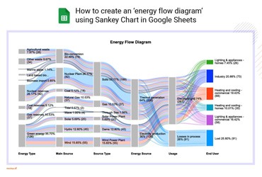
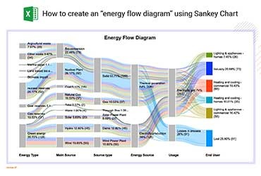
What is an Energy Flow Diagram & How to Create it?
Explore the world of Energy Flow Diagrams using the Sankey Chart. Discover how these diagrams offer clarity in understanding energy systems.

How to Create a Customer Journey Visualization?
Click to learn how to create a customer journey visualization. Also, we’ll address the following question: what is a customer journey visualization?
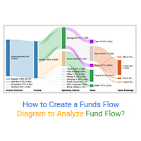
How to Create a Funds Flow Diagram to Analyze Fund Flow?
Click to learn what is a funds flow diagram? And how to create funds flow chart to analyze the funds flow/cash flow.
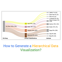
How to Generate a Hierarchical Data Visualization?
Click to discover how to generate a hierarchical data visualization chart. Also, we’ll address the following question: what is a hierarchical data...
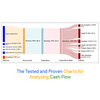
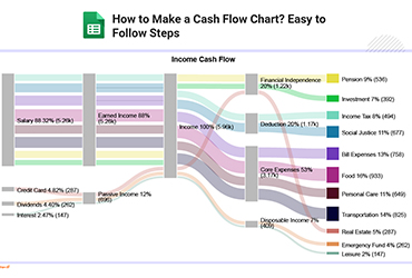
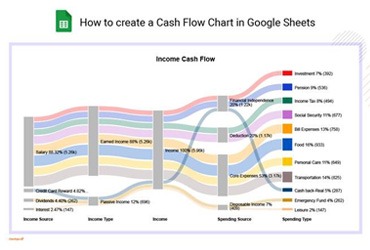
The Tested and Proven Charts for Analyzing Cash Flow
Click to discover the tested and proven way for analyzing cash flow. Also, we’ll address the following question: what is cash flow analysis?

Select a template

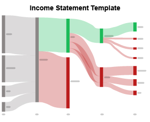
Income Statement Template
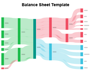
Balance Sheet Template
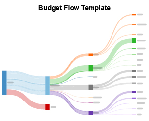
Budget Flow Template
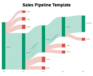
Sales Pipeline Template
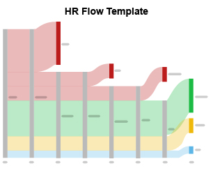
HR-Recuriments Flow
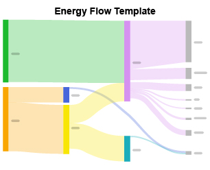
Energy Flow Template
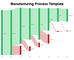
Manufacturing Template
Healthcare Template
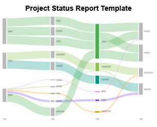
Project Status Template
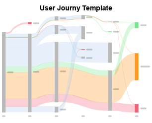
User Journey Template
Leads Tracking Template
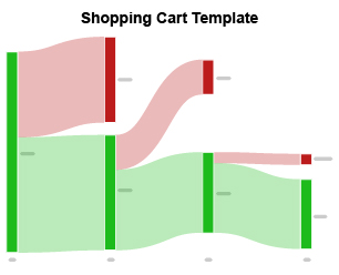
Shopping Cart Template