Column Charts
Get More From Your Data Analysis
In today’s data-driven world, you need effective charts and graphs to make accurate and timely decisions. Otherwise, you won’t be able to make sense of overwhelming analytics efficiently.
Column charts offer a familiar solution to visual analysis problems. It’s one of the most versatile and universal tools for charting data.
ChartExpo makes data analysis even smoother by offering the best column chart maker available. You can create charts in just 3 easy steps, with no tedious coding or setup necessary.
See the power of ChartExpo and column charts today.
Google Sheets
Microsoft Excel
Free 7-day trial (no purchase necessary). Pricing starts at $10 per month.
 ChartExpo for Google Sheets is
 used by 695,000+ users worldwide!
Click this link to watch a ChartExpo for
Google Sheets single-user installation video.
Click this link to watch a ChartExpo for
Google Sheets admin installation video.
Click this link to watch a ChartExpo
for Excel single-user installation video.
Click this link to watch a ChartExpo
for Excel admin installation video.
What Is a Column Chart?
Column charts are popular visualization tools for a good reason. It is one of the most versatile, easy-to-read chart types available to data users.
Column charts are a top-tier visualization option whether you need to analyze frequency, make comparisons, see data distribution, etc.
The more you know about column charts, the easier it becomes to unlock hidden data insights. Explore column charts and what makes this visualization so exceptional.
Column Chart Definition
A column chart is a graph that uses vertical bars to express the value or frequency of items in your dataset. Each bar represents one of these items or categories.
Typically, column charts depict categorical data in relation to a numerical scale. The height of each column reflects the value of that particular item. Thus, the tallest bars show the details with the highest value for the specific measure.
It’s an ideal visualization for comparing items and quickly assessing your most and least significant values.
There are many variations of column charts. Clustered, stacked column charts and other types of bar charts add extra layers to this popular visualization choice.
By including extra dimensions of data in your column graphs, you can create advanced charts featuring more insights. In other words, you pack more information into a single visualization.
For instance, rather than looking at sales data for 5 separate store locations, you can create a stacked column chart in Excel using ChartExpo that shows the same data divided by each quarter.
You can even create a stacked Column Chart with three sets of data and more. That said, be careful with adding too many dimensions into a visualization because it will lead to an overwhelming chart.
Bar Chart Vs. Column Chart
The conversation regarding Column Chart vs. bar chart visualizations can be confusing. It’s not as easy as discussing the differences between column and line charts.
One way to explain the difference between bar graph and column graph visualizations is that all column charts fall under the umbrella of bar charts. However, not all bar charts are column graphs.
The bar charts category encompasses both vertical and horizontal examples. Column charts, however, are strictly vertical bar visualizations.
There are some advantages to horizontal versus vertical bars, meaning there are also advantages of using Column Graphs over other types of bar charts.
For horizontal bars, labeling is easier because the text for each category or item is also oriented horizontally, the way we naturally read words on a page.
On the other hand, Column Charts excel at including more items in a single visualization, especially when you create clustered Column Charts and other more advanced variations.
Again, more data items mean a more in-depth understanding of the data itself, leading to the discovery of more significant insights.
Column Charts also tend to be better for comparing values compared to horizontal bar charts. You can easily scan left to right and see the most important items in the set.
Column Chart Examples
It’s always better to learn through examples. Examples provide real-life situations and problems that you can solve with column charts.
Through these sample column chart templates, you’ll see how effectively these visualizations transform raw data into actionable intelligence.
Column Chart Example 1: Jillian owns a budding, multi-store retail enterprise. She’s worried that her company has expanded too quickly and may need to be scaled back.
To ease or validate her suspicions, she creates a clustered stacked Column Chart in Excel that provides a thorough rundown of her revenue. Specifically, she wants to see every store’s revenue broken down by product lines across each quarter of the year.
Jillian can extract lots of actionable intelligence using her new visualization. It essentially shows the when, where, and how of her sales revenue. For instance, she can see which stores sell the most, the best-selling products for each quarter, how audiences from separate locations behave differently, etc.
Most importantly, Jillian can begin detecting the less profitable areas of her business, like a store location vastly underperforming or a product line that just isn’t selling. By fixing or stopping these strategies, she can protect the continued positive growth of her company!
Column Chart Example 2: Alex is a pay-per-click advertiser using Google Ads to capitalize on search engine users. She knows keywords are the lifeblood of successful ad campaigns.
To help discover outstanding search terms to target, she uses a double Column Chart to show two dimensions of data for each keyword.
Alex wants to look specifically at costs versus search volume. With the double Column Chart design, she can quickly identify keywords that have high values for search volume, but relatively low ones for costs.
With this data visualization, she can better optimize her keyword selections and stretch her ad budget even further!
Column Chart Example 3: James, the manager of a competitive sales team, wants to analyze the performance of his staff. Particularly, he wants to identify the best and worst individuals on his team at sales.
Using a Column Chart, he can visually depict how every sales employee stacks up to one another. James can quickly identify which employees need additional sales training simply by looking for the shortest bars in the Column Chart.
He makes two changes thanks to his Column Chart analysis. First, he applies the insights to scheduling, ensuring every shift includes a healthy mix of sellers with high and low success rates.
Then, he encourages his top performers to offer guidance and advice on making sales to individuals on the lower end of the performance spectrum.
What Is a Column Chart Used for?
The versatility of column charts means these graphs fill a variety of roles and purposes. You can display the majority of your datasets with some type of bar chart. Of course, there are times when a Column Chart is more applicable than others.
Many people consider Column Charts a type of comparison chart because you’re typically comparing the height of each bar to one another.
This enables you to immediately identify the most and least significant factors in your data. That alone is a valuable insight, increased further the more dimensions you add to your chart.
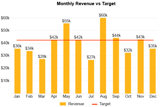
For example, it’s helpful to chart your month-to-month revenue data to determine times of low and high sales volume.
However, it’s even more valuable to take that same data and see specific product lines generating revenue for each period. This shows you when to expect high and low sales and which products are the highest selling at different times throughout the year.
You can also use this type of visualization to make parts of the whole comparison using a standard or 100% stacked Column Chart.
This allows you to see the exact parts that contribute to a whole sum, such as the different sources of your website traffic or which salesperson(s) made the highest volume of sales compared to the rest of the team.
Anytime you want to compare items in your data, the Column Chart shines.

Types of Column Charts
The versatility of column charts provides a decisive competitive edge. You need to understand each type of column chart to make the most of this advantage.
Aligning your data with the correct type of column chart allows you to unlock deeper and more actionable insights. You’ll start making those monumental discoveries that lead to powerful change and growth!
See everything that column charts bring to the table.
Basic Column Chart
A basic, traditional column chart (or vertical bar chart) measures one dependent variable and one independent variable. Column chart plots utilize X and Y axes.
The X-axis shows your independent, categorical data. These are the items you’re measuring. Meanwhile, your Y-axis reflects your count data. It’s the numerical scale you’re using to measure the value of each bar.
In a horizontal bar chart, the roles of these two axes switch. The categories appear along the vertical axis, while the numerical scale shows along the horizontal path.
Basic Column Charts are straightforward and simpler than the other variations we’ll discuss shortly.
However, that simplicity can be an asset in some scenarios. Adding more dimensions to the data increases the depth of the chart and how many insights you can discover, but it’s not always necessary.
In fact, there are cases where supplying more information than needed can actually detract from your charts and presentations.
Proper visual data storytelling requires you to be concise in your charts. Sometimes, a basic Column Chart is the best option because of how clean and simple it is. There’s nothing to distract the audience from the intended conclusion you want them to reach.
So, don’t think that the simplicity of standard Column Charts is a detriment. It can be extremely valuable in the right circumstances.
The results are powerful when you can portray complex data with a basic visualization.
Clustered Column Chart
A clustered column chart (also known as a grouped column chart) adds subcategory data to the visualization, allowing you to add greater detail.
Each primary category acts as a bin. Within this container are vertical bars for each subcategory. These columns are arranged in tight groups to keep each bin separate.
Let’s say a nonprofit organization throws four major events annually and wants to see the donations from each event across the last five years.
A clustered Column Chart is perfect for this example because it shows which events generate the most contributions in dollars and how these amounts have changed year to year.
In this scenario, each year acts as the bin or main category, while the four individual events are the subcategories.
When designing a clustered Column Chart, it’s important that your subcategories remain the same across each cluster. Otherwise, you may be making comparisons between items with no correlations.
It also makes it easier for audiences to understand the chart because each cluster shares these similarities. It’s only the bin categories that change.
Color is also vital when you create a clustered Column Chart. You should use it to differentiate each subcategory. You can include a key to let the audience know what each color represents, cutting down on how many labels you need to have in your visualization.
Clustered Stacked Column Chart
The clustered stacked column chart combines two effective chart types. As discussed above, the clustered columns chart groups subcategories together to enable you to add extra dimensions to your chart.
Stacked Column Charts layer bars on top of one another, adding yet another level to your visual analysis.
The same nonprofit using a clustered Column Chart to display contributions from each of their annual events could use the stacked variation to then divide each bar by the types of donations.
The 100 Stacked Column Chart is another variation within this group worth exploring. In this design, each bar is the same height, reflecting 100% of a given value or measure.
Each bar is divided into smaller subcategories or parts and the size of these pieces reflects how much they contribute to this 100% mark.
Labeling becomes a challenge when creating a stacked clustered Column Chart. You now have two layers of subcategories that need to be defined.
Even using a key to identify each component may lead to confusion. Thus, you must be careful with how many bars (clustered or stacked) you include.
That said, stacked clustered Column Charts can display a high level of information and data. This advantage makes it valuable when you need to give a detailed, thorough view of a complex dataset.
Double Column Chart
Clustered and stacked column charts are great when you have lots of things to compare. However, the best comparisons often occur between two items.
The double column chart exists to maximize the potency of these comparisons. Column charts are already terrific comparison analysis tools. With the double column design, you can compare an additional variable within each category.
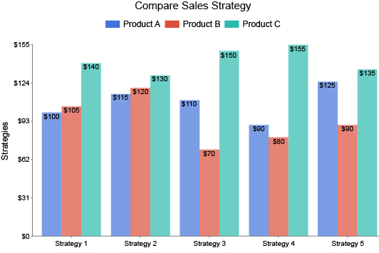
You can use a double column chart to make before and after comparisons or weigh one strategy against another.
For instance, if you redesign your website, you want to know if the new version is increasing results. The double Column Chart is perfect for this and many other before-and-after comparisons.
While clustered Column Charts have the advantage of comparing even more items, this isn’t always needed. It can also muddle your decision-making capabilities.
The best comparisons often happen between two items. It’s effortless to decide between the two. Adding more items to the mix makes it harder to make a declarative ‘this or that’ decision.
Again, it comes down to delivering the best possible data stories to clients, stakeholders, etc. You want to show them exactly what they need to see to reach the proper conclusions. Adding extra details when they aren’t necessary only distracts these individuals from the core insights you’re hoping to convey.

How to Create Column Charts for Your Data
Creating column charts is something we all learn from an early age. What we don’t learn is how to make bar and column charts efficiently.
Data moves fast. Taking too long to make column graphs means the information may no longer be valid or useful.
That’s why ChartExpo removes unnecessary steps and headaches in data visualization. It allows you to create charts in mere minutes. This agility gives you the chance to become proactive in your data management processes and not reactive.
Experience the best way to create column charts.
Setting Goals for Your Column and Bar Charts
Creating a chart should start with a question or problem. Visual analysis helps you answer valuable inquiries about your data and strategies.
In other words, the charts you create need to have a purpose. Visualizations can be beautiful and engaging, but what is the point if the insights don’t provide actionable intelligence on improving your efforts?
The objective or question your chart solves needs to be relevant and valuable to your organization. It should align with your company’s overarching goals. This ensures the information you acquire from your visual analysis helps your business improve and grow.
Setting an analysis goal takes just a few minutes and will save you time by the end of the process.
Keeping a goal in mind will serve you in several different ways:
- An analysis objective informs what data and chart type to use (and which to ignore).
- It ensures your chart stays on topic and doesn’t stray off course.
- If you have to put the analysis on pause or become distracted by other goals, you don’t have to relearn what the chart is about; the goal quickly tells you the purpose.
- When other people join the analysis, the goal lets them know what they are working on.
The culminating effect of these small benefits is simple but impactful: you spend less time charting and more time turning insights into actions.
It’s about performing visual analysis as efficiently as possible, saving time for the more critical tasks and responsibilities on your to-do list.
Using the Correct Column Chart Template
With so many column chart types to choose from, knowing when to use each one becomes one of the hardest parts of the process.
Luckily, your goal from the previous section will play a significant role in eliminating the challenge of picking a chart type.
When creating the best possible visualizations, it’s crucial to keep your charts lean and concise.
Including extra details doesn’t always add to the value of the diagram. In many cases, the additional data dimensions distract from the main point you’re trying to convey. You also risk developing charts that are simply overwhelming to look at.
So, as you add details to your charts, you should think critically about whether each element is necessary to the audience’s understanding.
Remember, charts are like data stories. You only want to include the most relevant details that help the audience understand the characters, plot and conclusion.
Arguably, the first question you ask should be, “Can I tell this story with a standard Column Chart?” Since these diagrams are the most basic and concise, they are ideal tools for compelling visual data storytelling.
Of course, there will be plenty of instances where you can’t effectively convey the data with a regular Column Chart because there are other dimensions vital to your storytelling.
You may then have to ask whether you can effectively deliver the data with a double Column Chart. Alternatively, you may need a clustered or stacked column chart instead.
The bottom line is less is usually more. Even though there may be other interesting data, if it doesn’t support the conclusion you want the audience to reach, it’s best to leave it for a different visualization.
How to Create a Column Chart in Excel
It’s easy to learn how to make a Column Chart in Excel. The spreadsheet tool offers a free Column Chart maker within its service.
So, why invest in a tool like ChartExpo? The problems start when you want to know how to create a clustered Column Chart in Excel and other more advanced visualization types.
While it is possible to stack columns in Excel and make other edits to your charts, the interface can be confusing and time-consuming.
ChartExpo alleviates these pain points (and many others) with its straightforward interface that anyone can use to develop beautiful, custom charts.
To start creating a Column Chart in Excel, you first need to download the Column Chart creator from the Microsoft AppSource. This is a simple process, no different from downloading any other tool.
The next time you open Excel with ChartExpo installed, you’ll find the tool under the “Insert” menu. Some Excel versions may need to look under “File” instead to find their installed Excel apps.
When you first open ChartExpo, the tool asks you to choose a chart type. ChartExpo provides over twice the visualization options of Excel’s standard offerings. You can use the search bar to locate the many variations of Column Charts.
With a chart type selected, the rest of the process is exceedingly quick and simple. You can highlight the area of your spreadsheet you want to visualize and then create a clustered Column Chart based on the selected data.
Your new Excel clustered Column Chart (or any other variation of this bar graph) appears instantly. You can save each chart separately as an image or PDF file, making it exceptionally easy to communicate charts through email, presentations, social media, etc.
How to Make a Column Chart in Google Sheets
To create column charts in Google Sheets, you’ll follow a very similar process to how to make a Column Graph in Excel. The primary difference is where you download the ChartExpo Column Graph creator.
While in Google Sheets, click on “Extensions” from the top toolbar, followed by “Add-ons” and “Get add-ons.”
This will open the Google Workspace Marketplace, where you can search and install ChartExpo. After properly installing ChartExpo, you’ll find the tool under this same “Add-ons” menu.
From this point, the process is nearly identical to making a Column Graph in Excel with ChartExpo — you search for the Column Graph example you want to make, select it and begin grabbing your data.
So, if you wanted to make a stacked Column Chart in Google Sheets, you’d enter “stacked column chart” into the search bar. This will filter out all other visualizations, leaving only the Google Sheets stacked Column Chart option.
Next, you’ll need to select your data. You can highlight your spreadsheet and create a chart from the selection. Alternatively, you can enter the data manually. This takes more time but gives you greater control over what information to include in your charts.
Once you’re satisfied with your chart type and data selections, click the “Create Chart” button to finalize your visualization. Your Google Column Chart will appear instantly.
You can make minor edits to your chart creation, like editing fonts, colors, labels and so on. Don’t forget to save every visualization you make. This will enable you to insert or attach charts in emails, presentations, documents, etc.
Remember, knowing how to create a Column Chart in Google Sheets is only the beginning. ChartExpo offers tons of visualizations to explore and use for all of your data analysis needs!

Advantages of Column Charts
The versatility of column charts only scratches the surface regarding the benefits of this visualization.
Column graphs are helpful because of the pictorial nature of the visualization. Bars or columns are better at drawing comparisons than other shapes (think pie charts).
Plus, you can easily scale a bar chart to include more data or variables. It is an exceedingly flexible chart choice.
Are you making the most of column charts?
A Familiar and Universal Chart Type
Column charts have the added benefit of being one of the most popular visualizations in the world. This means that every member of your audience knows what this chart is and how to read it.
You don’t have to include any explanation or description of what your Column Charts are showing because the audience already knows how to interpret the information.
This also means that people spend less time comprehending your Column Charts. Not only is this helpful from an efficiency standpoint, but it also makes your charts more welcoming to audiences.
Think of it like serving the audience their favorite dish. They’ll naturally gravitate towards it over the other available options because it’s familiar.
This is especially true when including Column Charts in reports with multiple other visualizations. People will tend to look at what they know first, meaning they’ll skip over unfamiliar visuals in favor of Column Charts, line graphs, etc.
Thus, when you need to present complex data topics or insights, Column Charts deliver the intel using a medium the audience knows and understands.
It can be a great introduction before you show the audience more complex, advanced charts.
Perform Multiple Types of Analysis with One Chart Type
One of the reasons Column Charts are so universal and familiar is because of how versatile they are. Any time you’re presenting data for multiple items, you can depict that information with this visualization design.
Having a versatile chart type capable of multiple types of analyses is a massive advantage. You can rely on Column Charts for many of your analysis projects.
You don’t have to constantly look for a new visualization whenever you want to analyze your data.
You can conduct any type of comparative analysis using Column Charts. Thus, you can compare different strategies, products, competitors, prices, locations, points in time, etc.
Some people also use Column Charts to depict the distribution of data across multiple categories.
For instance, an Internet advertiser may use a Column Chart to see how many conversions occur for each hour of the day. By seeing how this metric distributes across each point, the advertiser can identify which times customers are most likely to purchase throughout the day.
In short, Column Charts are almost always a viable visualization option. There are many cases where it is the best chart type because of how easy it is to compare values and identify the most and least significant elements in a dataset.
Draw Easy Comparisons across Several Categories and Variables
Comparison analysis is one of the most popular analysis methods. After all, comparing items is something we do very instinctually.
When you open a menu at a restaurant, you start comparing the different options. You compare outfits to wear each day and routes to take to work based on time and traffic. You’re essentially a comparative analysis machine, even without charts.
That said, Column Charts help with these comparative decisions, allowing you to make choices quickly and more accurately.
Considering how many decisions you make in a single business day, having a tool to make this ordeal faster and more effective is a precious asset.
Essentially, Column Charts help you make more daily decisions and actions. You simply get more done! You’re not only optimizing your data analysis but also your time and performance!
Column Charts are also powerful because they enable you to see results across multiple items and categories. Including so much data in one visualization helps you make sense of complex decisions involving many potential choices.
You can easily navigate the data, see the most valuable prospects and separate them from the average or insignificant elements.
You don’t have to create multiple charts or struggle to make sense of larger datasets. Column Charts allow you to recognize the top values immediately.
Detect the Significant Parts in Large Datasets
When performing comparative analysis, the goal isn’t always to find singularly the best element to fuel a decision. Sometimes, you want to identify multiple top performers versus weak ones.
This is another scenario where Column Charts shine. As you compare the size of each bar, it is easy to identify the smallest and most significant components, even when they are in clusters or stacked columns.
This type of analysis helps you understand what’s working versus what isn’t, especially if your dataset isn’t ordered. For instance, a digital marketer may chart engagement metrics for each type of blog post to understand what content formats work best and should be used most often.
Alternatively, that same digital marketer may use Column Charts to map the performance of keywords. The visualization effortlessly shows the best and most popular search terms to target.
Without a Column Chart, you may be able to spot the top value in a large dataset, maybe even the top three. However, the rest of your top items get lost in the mix of numbers.
Often, you already know what the top items are. This analysis approach primarily focuses on finding your other top performers that aren’t already known.
While knowing the top value items in a dataset is critical, it’s also vital to know your lowest performers. These data pieces may represent strategies that need to be stopped or paused because they aren’t effective.
In other cases, the lowest performers are actually an asset because they reflect the items with the most considerable room for improvement.
Imagine you run a car dealership. You use a Column Chart to look at the performance of each salesperson. While it’s nice to know the best employees on the sales floor, recognizing who is struggling is arguably more vital.
These are the individuals that need additional training to increase their success at selling. They are also the salespeople with the most significant room for improvement.
If Jane successfully sells a car 92% of the time, there isn’t much you can do to improve that number. However, Jim with only a 23% success rate has a huge opportunity to improve his performance and the overall sales of the dealership.

Why ChartExpo Is the Best Column Chart Maker
There are many chart makers on the market. However, few offer the same benefits as ChartExpo.
Not only do you get a robust charting gallery with visualization options for all types of data, but you also receive the most efficient chart maker available.
ChartExpo creates column charts and other visualizations in minutes with its simple 3-step process.
Discover how easy chart-making should be.
A Codeless Way to Make Stacked and Clustered Column Charts
Do you have a background in coding or JavaScript? Does someone on your team? If you answered no to these questions, you might be locked out of using most data visualization tools.
Many of these software services rely on premade JavaScript templates to insert column charts and other visualization types into Excel and other programs.
Without coding expertise, editing and using these column chart templates requires more work than it’s worth.
Even with a background in coding, editing scripts to make charts is highly inefficient. You can be fluent in JavaScript, but editing your templates to fit your data still takes considerable time.
If you make a small error (even a simple mistype will cause problems!), you’ll waste additional time trying to find the mistake.
ChartExpo offers a code-free alternative. The tool automatically does all of the JavaScript work for you in the background. You never even have to see a bit of code.
This removes the chance for errors and offers a more efficient chart-making tool.
Even when you start creating more complex stacked and clustered column charts, you don’t have to worry about complex settings or charting processes.
ChartExpo’s design makes it exceptionally easy to engage with your data and draw column charts (and other visualizations) in mere minutes.
A Simple Column Chart Maker to Create Advanced Visualizations
By removing the coding requirement from data visualization, ChartExpo effectively distills the process down to its core parts: chart type selection, data input and making the chart itself.
It sounds easy because that’s how chart-making should be. ChartExpo makes timely and efficient visual analysis a reality.
The process is simple after you download ChartExpo for Excel or Google Sheets:
- Choose your column graph type from ChartExpo’s massive library of different visualization options.
- Tell ChartExpo what parts of your dataset you want to use by clicking and dragging or manually inputting data.
- Click “Create Chart” to finalize your new chart.
Once you click this button, your new column chart instantly appears next to your data.
Thanks to this straightforward, efficient column graph maker, you can transform raw data into simple and advanced visualizations in as little as three clicks.
Faster charting means more time to analyze your results, extract insights and make data-driven decisions using the intel.
Speedy decision-making is vital in today’s business environment. It’s a competitive differentiator. If you take too long to detect and act on data, the value of your changes is less.
Column Charts and other visualizations give you the tools to mitigate risks before they become problematic and jump on opportunities ahead of competitors.
One of the Largest Chart Galleries on the Market
Variety is the spice of life, right? Well, with ChartExpo you receive a chart library with more than double the visualizations offered by Excel, Google Sheets and other popular data tools.
Many of ChartExpo’s visualizations specialize in unique types of data. For instance, the Quality Score Chart for Google Ads users or the Star Rating Chart to make sense of customer reviews.
ChartExpo also includes every variation of column charts, like a stacked column graph, radial column chart and more.
That said, having so many different chart options isn’t just a convenience. It has real value.
For one, ChartExpo’s selection of charts ensures that you always have the perfect visualization to match your data and present the information. This means you have the visual tools to extract maximum insight and understanding from a spreadsheet or dataset.
More visualization options can also result in greater insights. After all, you can depict the same data using multiple graphs and diagrams.
Each new chart type acts as a fresh perspective on the information. Looking at your data from various angles gives you a complete understanding of what’s happening behind all the stats and figures.
ChartExpo makes it quick and easy to change chart types, allowing you to view your data from every possible angle.
Empower Data Communication with Better Column Charts
Column Charts and other visualizations aren’t just valuable to you and your understanding. Visualizations also enable you to effectively share data findings with others.
There are many instances when communicating data results through charts is critical. You may have individuals in your organization that benefit from understanding your data stories.
This is particularly true when you have stakeholders or clients that request reporting. These parties want to know what’s happening with the data and how your efforts (or the efforts of others) have positively or negatively impacted results.
Since these individuals don’t interact with the data regularly, giving them raw figures or sheets of numbers doesn’t work well. It’s overwhelming and confusing.
Charts enable these audiences to engage with data in a more comfortable and familiar format. Anyone can read a chart, regardless of their data background. It’s obvious to see when data is trending up or down.
Insights jump off the page when shown visually, meaning audiences will understand the data almost instantaneously. This is a crucial benefit when presenting findings to busy clients or stakeholders.
It’s also ideal for sharing insights between departments or with team members. A visual analysis leads to faster discovery, meaning you can spend more time collaborating and brainstorming the next data-driven decision to make.
ChartExpo Pricing
ChartExpo for
Google Sheets
$10*
per month
(no purchase necessary)
*pricing starts at $10
per user per month.
Only in-app purchase available
ChartExpo for Google Sheets
single-user purchase video.
ChartExpo for Google Sheets
admin purchase video.
ChartExpo for Google Sheets
single-user installation video.
ChartExpo for Google Sheets
admin installation video.
ChartExpo for
Microsoft Excel
$10*
per month
(no purchase necessary)
*pricing starts at $10
per user per month.
Only in-app purchase available
ChartExpo for Excel single-user
purchase video.
ChartExpo for Excel admin purchase video.
ChartExpo for Excel single-user
installation video.
ChartExpo for Excel admin
installation video.
Custom Pricing
Blogs
Top 4 Inspiring Data Storytelling Examples
Click to learn the top 4 data storytelling examples using charts and graphs. Also, we’ll address the following question: what is data storytelling?
Best Types of Charts and Graphs for Data Visualization
Click to learn the best types of charts and graphs for visualizing data. You will also learn how to create these different types of charts and graphs in excel.
How to Visualize Futures’ Data with Bar Chart?
Click to discover more about the Bar Chart Futures. You will also learn when should you use them? And how to visualize futures’ data with bar chart.
