Categories
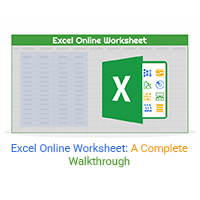
An Excel online worksheet is a browser-based spreadsheet you can access anywhere. Click here to learn how to edit, chart, share, and manage data online.
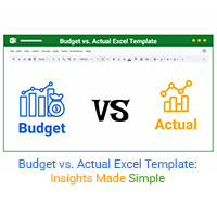
A budget vs. actual Excel template compares planned vs. actual spending. Click here to learn how to create, use, and analyze it for better financial decisions.
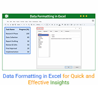
Discover data formatting in Excel for clear, organized spreadsheets. You’ll learn simple steps to format, clean, and analyze data with top tools and charts.