Categories
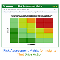
A risk assessment matrix ranks risks by impact and likelihood. Click here to learn how to use it effectively with examples, tools, and Excel tips.
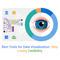
Best tools for data visualization help avoid errors, improve clarity, and align teams for accurate decisions. Read on to choose the right one.
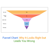
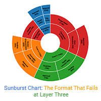
Funnel chart visuals often mislead by hiding data issues, false metrics, and misaligned teams. Learn how to question what the chart isn’t showing. Read on!